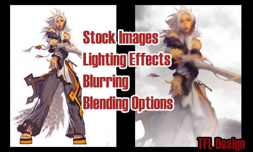
In this tutorial, I will teach you how to successfully use and blend stock images with your Anime or Game characters you’ve just finished extracting from a scan. One of the hardest things to do is to make a new scenery as a background for your character without having to paint it from scratch. You don’t want the character to look fake and what I call a “slap-on-sticker” on an obviously realistic background. We can prevent this by doing a few key things. Match the LIGHTING of the scan with the background, Blur the stock and scan ever so slightly, and Blend the scan with the background using more stocks. You will need to have read my other tutorials to fully understand this tutorial, mainly these:
1. Scan Extractions
2. Layer Masks
3. Intense Contrast/Glow Effect With Monotone
Let’s begin shall we?
Using one of my saved PSD files of a MySpace Layout, I will attempt to reconstruct the image step by step. It may be slightly different from the actual end result, but the theory is the same. In theory, anything you can think of can be created, provided you find the right stock images to work with. It’s all a matter of time and dedication. I’ve done blending work that took me 2 Weeks to finish (on and off of course) and then some equally creative work within 5 Hours. It’s a matter of experience and trial and error really.
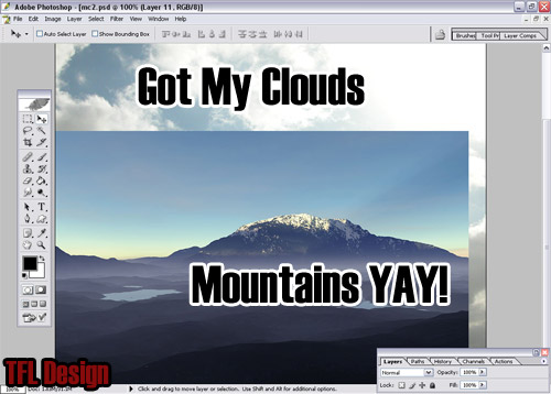
In this project, I had wanted to create a serene atmosphere for this warrior and so I started off with a stock photo of a mountain background and envisioned a bright background with some clouds.
Obviously we have to blend them now. But just for kicks, let me show you what I mean about the “slap-on-sticker” effect. CLICK TO VIEW SCREENSHOT. Isn’t it horrible? We can prevent that, but first let’s work on the background.
We can do one of a few things to make the images match and look as if it were the original artworks. We can either make the character more realistic to match the stock images or we can make the background look more like cartoons. Assuming you are like me, in that we cannot paint realistic scenery, much less human skin tones – we will choose the second option. To make the realism tone down a bit, we would use the steps as described in the first part of the Intense Contrast/Glow Effect With Monotone Tutorial, minus the monotone colorization part. (We are also setting our top layer to SOFT LIGHT.) The blurring and duplicating/blending of layers is all we need. Doing this to both the Cloud and Mountain images would give me a slightly less realistic look. You can play around with the blurring effect, (on all layers – even the Soft Light layers can be blurred a bit) lowering/raising it a bit, depending on how your perspective of depth is preferred. (The blurrier something is, the farther away it is…) As I had explained earlier, everything is trial and error. After toying with my layers a bit, I realized I could simply connect the two Mountain Layers together (On Layer Palette, activate the paper-clip looking icon next to the eyeball to Link two layers – then LAYER > MERGE LINKED on Toolbar.) and blend it right into the Cloud Layer. I blended it with the OVERLAY Blending Option. (Flattening the layers then further blurring them would make the most sense, rather than blurring the Soft Light layers.)
How To Blend : On Toolbar at the top of Photoshop – LAYER > LAYER STYLE > BLENDING OPTIONS… or on Layer Palette, RIGHT CLICK Layer and choose BLENDING OPTIONS. CLICK TO VIEW SCREENSHOT
This is the tricky deal with Blending. Depending on what colors are blending on what, your images may not blend successfully in the same modes as my demonstration blends. This is because Black blending on Green stands out differently from White on Blue, etc. TRIAL AND ERROR. Remember to play with the OPACITY and use Layer Masks to gradually blend things as well.
Here’s what I got : CLICK TO VIEW SCREENSHOT
Right now it is VERY fake with the colors barely connecting with each other. Here comes the Intense Contrast/Glow Effect With Monotone Tutorial to the rescue, only you’re using the colorization part this time.
Here’s what I got : CLICK TO VIEW SCREENSHOT
See how the colors match better? When you take two different stock images and blend them, it is important that their color tints are the same color. Even if they are different in the slightest way, it is noticeable to the trained eye, so just make it a habit to blend a solid color over it (using any blending option you see fit) even if the opacity you set is to only 10%. The sunlight in one stock might be more orange and the other might be a lot whiter… It’s safer just to make your own color light.
Now to work on the Character Scan. First off, noticed the source of light on the original scan yet? It’s sort of drawn in a way that the light comes above and blasted from the front of the character (facing the character) rather than from behind. If a light source is coming from behind, the face of the character would be sort of shadowy and the shoulders and clothes would receive a kind of glowing rim treatment. This is not the case and the lighting to this particular scan can be easily adjusted.
View In Detail : CLICK TO VIEW SCREENSHOT
First let’s make the character image match the background in its smoothness. Repeat the duplicating and blurring effect of the Intense Contrast/Glow Effect With Monotone Tutorial. (Once again, we are setting our top layer to SOFT LIGHT.) I usually do not Link and Merge the images, because when you do, a visible white outline is seen. You can get rid of it by clicking Ctrl and simultaneously Click the Layer on the Layer Palette to create a marquee sort of field around it. Then go to the Toolbar and click Select > Feather… and only choose a Feather Radius of 1 px. Then click Select > Inverse and you will notice everything outside of the character is being marqueed. Click Delete about 1-3 times to delicately erase away the outsides. Click Select > Deselect to un-marquee everything and view your results. OR DON’T BOTHER CONNECTING THE LAYES AT ALL AND JUST REPEAT THE LIGHTING OPTIONS ON BOTH LAYERS. This is probably the easier way with a much more desired result as Feathering can lead to blurry outlines and can be assumed as a blur attempt to hide horrible extracting. (The Lighting Options will remain at the same angle as long as you do not move the character image after Rendering it. This makes it easier to repeat.)
Here’s the bothersome part. I can’t take screenshots of the Lighting Effects Options because my computer is unable to do so when that option is active. Therefore I can only describe it to you. To change the lighting, be sure the character scan layer is active and on your Toolbar, go to Filter > Render > Lighting Effects… An option to change lighting pops up, giving you control of where the light source originates from (by moving and stretching / shrinking the oval or sphere controls and even what color lighting. (The small white squares on the right are default – white light and Spotlight are the default settings.) You can play around with these options and find that they are a lot of fun with a lot of different lighting options, but for the purpose of this tutorial, the default white SPOTLIGHT is all you need. The only thing you have to do is stretch and move the controls on the left to change the lighting. Our sky is bright, but a big blob of white is coming from the right, so move it accordingly. You want to stretch the oval past the images so that there won’t be a bright white glare on the character. Trust me, the intensity is great so stretch it far. Below is an example of what I mean.
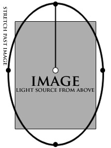
Remember for our particular image scan, I’ve tilted the angle of the lighting a bit and maybe stretched it further. I’m imagining on a cloudy but bright sky, you’re not exactly shining as brightly as the sky…
Here’s what I got : CLICK TO VIEW SCREENSHOT
Okay now. If I were to have the character stand there under those lighting conditions, the Sandals and Feet would need changing. I would do one of two things:
1. Duplicate the character image (Merged and Linked for this case) and make the lighting of the bottom part darker (as a result the face would be too dark but we won’t be using the face portion anyway), then use a Layer Mask to negate the top portion, only giving the character darker, more shady feet.
2. Create a new layer and using the transparent to color gradient, spread a thin and low opacity layer of Black over it. I’d have to play around with it for a good result.
Creating a persuading SHADOW would be the final touch in making this character seem as if standing on solid ground. Use a Soft Round Brush and paint on a new layer underneath the feet and extend a bit for the body. Use the Blending Mode SOFT LIGHT to fade it.
But since I planned for neither, here’s the cheater’s way : Have something BLOCK THE FEET. Make it grass, pillars, a table, a fence, or in my case, a fog. (a.k.a. Clouds)
First, I made a new layer and did as explained in #2 above. To make the character seem more convincingly on the ground, I made a light gradient of black. You would drag from the bottom and go upwards slightly until you reach a little above the knee.
View In Detail : CLICK TO VIEW SCREENSHOT
Now to blend our “Fog” over the whole thing. The first thing you need to do, is find the right stock. I found mine years ago at somewhere I don’t remember and have been using this same stock image for years now. The right cloud image should not include a lot of sunlight and most preferably, it be in Black and White. (If it isn’t, you can always make it black and white – On Toolbar Image > Adjustments > Hue/Saturation and make Saturation the lowest it can go to turn the image Black and White.) My stock looks like this :
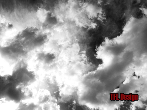
Notice my Stock Image has a lot of texture to it, has dark and light spots and most importantly, is in black and white. Now no stock is perfect and so it doesn’t matter if you don’t find one that looks like mine. Blending one complete cloud image over something looks bad most of the time. That is because one part of the puff of clouds might blend nicely, but to the left of it, the empty black spot might have made a weird looking color on the area it blended over or something. This is where DUPLICATING LAYERS and using LAYER MASKS comes into play. A lot of my projects, especially my wallpapers can have over 100 Layers to it, 30 of them being the clouds/fog alone. No stock is made specifically for my mind’s project, therefore we have to make it seem that way by using the favored parts of the stock over and over again. If you like the effect of one puff of clouds, keep that, create a layer mask and take the rest out. Then duplicate that puff and go at it over and over again. After trial and error for some time, you will find this to be process faster for you. It is probably a good idea to duplicate the layers in the Blended Mode to see the right effects. In my case my Blending Mode was SCREEN. In that option, the color black disappears and only white is visible. (Which is why your stock should be black and white.)
Now BEFORE you attempt to blend stock clouds, keep this in mind : THEY ARE TOO REALISTIC FOR YOUR SCAN. Straight off the bat that is the first rule you must realize. An ugly attempt at blending clouds to look like smoke, fog, or just clouds can lead to a very NOOB-ISH look and can easily be recognizable as a stock blend attempt. Let’s avoid that. Before you blend it, BLUR IT. DO NOT blur it too much, because then you’ve done nothing but create a blur of white and grey. Guassian Blur about 2.0 or less pixels. This is best done with experience and taking notice of how good blends look.
If by chance your Cloud Stock, after blurring, blends quite nicely with your image without having to duplicate layers, etc, then more power to you.
Here’s Before Blur : CLICK TO VIEW SCREENSHOT
Here’s After Blur : CLICK TO VIEW SCREENSHOT
Basically, you’re done. Some other minor tips is that adding a new layer on top of everything and blending a solid color as described in the Intense Contrast/Glow Effect With Monotone Tutorial can help blend the character with the background if their colors don’t match. In my case, this wasn’t a problem. (Using a Low Opacity Hue or even the SOFT LIGHT Blending Mode may be preferred at this time.) You can also duplicate the cloud layers to make things seem more cloudy, etc, etc, etc… There you have it. That’s how I, Phoenix of The Forgotten Lair, do my blends. With harder images to work with that need a lot of cleaning (if they are pixilated beyond repair), I may add texture over it. My favorite textures are Smooth Concrete, Sandpaper, and any of that sort of stock textures to create a Grunge look. Usually just a medium opacity with the SOFT LIGHT blending mode will do the trick.